Lesson 6 Technical Analysis & Charting Price.
Lesson 6 – Technical Analysis & Charting Price
Deciding what to buy, when to buy and when to sell, for the beginner, is the hardest aspect of investing and trading. Only 15 years ago, the only information we had available to us was through our broker, the newspaper, magazines and subscriptions.
Most decisions for investing and trading were made by professional analysts and brokers, and typically this was using the technique of Fundamental Analysis: which is the analysis of a company’5 financial data, its management and competitive advantages.
The markets have changed in the last 15 years, and now at the forefront of the decision-making process is a technique called Technical Analysis.
In this lesson, you will learn about Technical Analysis. You will be introduced to Charts, what they represent and why we use them. And we will explore some key points on how to identify the balance of buyers and sellers using Japanese Candlesticks.
Technical Analysis is the most commonly used form of analysis for most traders and investors. Even those who analyse using Fundamental techniques will use some degree of Technical Analysis to assist in their decision-making process.
Technical Analysis is the study of price movements. It has 3 key principles:
- All information is reflected in the price of the share/market
- Prices move in trends, and trends persist, and
- Market action is repetitive.
The price of a share, or of a market index, is simply a reflection of changes in supply and demand. More demand means more buyers. Whereas more supply means more sellers. There could be many different reasons why supply or demand dominates. For example;
- Economic statistic reflects future industry activity
- Company announcement found favorable/unfavorable by investors
- Terrorism attack
- Institutional investors selling or buying large quantities of stock.
Whatever the reason for supply or demand affecting the price of the share, this information will be reflected by the activity in the share price. Hence. using Charts is the most influential tool you can use to determine stock movement.
Time Value
There are 2 types of Volatility: Implied & Historical.
Historical Volatility is based on historical returns, or the actual volatility of the position. The assumption here is that the historical volatility experienced in the past will reflect the volatility in the ‘future, for the same period of time.
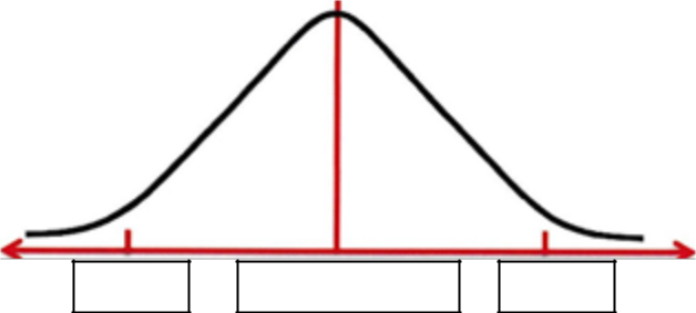
ITM
ATM – Strike
OTM
Implied Volatility is the volatility implied by the market price of the option using an option pricing model such as Black Scholes. It is considered the Current Volatility. It represents the market’s expectation of what value the option should be trading at in the future. We use Implied Volatility in pricing models to help establish whether the option price is over-valued or under-valued.
Volatility with Options refers to the ‘standard deviation’ of change over time. When we refer back to our Bell Curve, a Standard Deviation is the measure of variation or dispersion from the mean/average. For Options, the mean/average is the ATM strike. Therefore, a standard deviation from the mean is the ITM or OTM strike levels. One standard deviation from ATM would be the next TM & OTM strike levels.
Tega, is typically expressed as the amount of value the option will gain or lose as volatility rises or falls by 1%.
In this lesson, we have discussed advanced concepts for option pricing. We introduced you to the greeks and the Black Scholes pricing model. We further discussed Time Decay, which is represented ly the Greek Theta, and we discussed Volatility as represented by Vega. Finally, we introduced you to the Normal Distribution Bell Curve, and how an options Time Value is represented graphically.
This concludes the lessons in Chapter 1: Understanding Options and the Markets. We recommend repeating these lessons if any of the concepts are not quite clear, before progressing onto the next chapter: Technical Analysis & Charting.
Technical Analysis & Charting.
So why do we use Charts?
Charts effectively show us a broader picture of stock market information. Like they say, a picture tells a thousand words.
Charts are very easy to analyse, once you know the techniques to use and have practiced with them. We have taught literally thousands of people how to successfully read charts and understand the balance between buyers and sellers, from teenagers to retirees, tradespeople to professionals.
Fri 171
Decision making from the information you read from the charts will help you with your timing of entry and exit. There is nothing more frustrating than buying shares at a peak price, or selling shares at rock bottom. So instead of using the “Hope & Pray” strategy and randomly choosing a stock to purchase, we can use Charting and Technical Analysis to help define an entry and exit point.
And finally, having a proven method of success. There’s no point learning a technique if it is irrelevant and has very little success in profitability.
Let’s explore the components of a chart and where the information comes from.
So what we are looking at with a chart is plotting the price action for a given time frame. This could be daily, weekly, monthly or intra-day prices. For the rest of this lesson, we will be using Daily charts. That is, each measurement we analyse will represent one-day.
So the stock exchange releases data on price movements. The information correlated at the end of each day represents 5 pieces of information:
- The open price
- The high price
- The low price
- The close, or last price, and
- Volume
That’s it. The only other information are announcements, but that is not information that we can readily chart.
With these 5 pieces of information, we can start to plot activity onto a graph.
The Open and Close prices are viewed as the most important as they are the two “emotionally” charged points of the day. However, the interaction of the high and low levels in relation to the open & close prices can have a significant bearing on evaluating the sentiment of investnrc
occurred for that day, not on its own. Strong volume will reflect commitment from the markets. If the stock price rises and volume rises, we can assume that this reflects strong commitment from the buyers. But if the stock price falls and volume rises, then this would be deemed strong commitment from the sellers.
Let’s move forward and see how price is plotted onto Charts.

The first representation of price is the Line Chart.
Typically, the Line chart will only reflect one component of our data — the closing price. It is the most basic of charts available to us. Simply put, a Line Chart plots the closing prices of
the stock. Price
By doing this, we can more easily identify patterns forming. Remember, charts are a visual aid and pictures can tell a thousand words. The limitation of this method, however, is that it does not show us all the information we require to make the most informed decision possible.
It is useful, however, to conduct comparative performances of stocks, indices or markets as a whole. Let’s take a look at an example of a Line chart.
In this chart, we can see a comparison of the NASDAQ index and AAPL. By using a line chart, we can simply conduct a comparative analysis of the movement of the closing prices of the NASDAQ index and AAPL computers.

The next method of price representation is known as the Bar Chart.
In America through the 1980’s and 90’s, the Bar Chart was the most commonly used price analysis technique. It provided analysts with the opportunity of identifying patterns where the balance of supply and demand began shifting. For this reason, technical traders were able to better time their entry and exit points.
A Bar Chart shows us the 4 key pieces of information: Open, High, Low and Closing prices. The High and Low are plotted on the chart via a vertical line. This represents the range for that trading day. To denote the Open price, a tick is placed to the left of the vertical line. The Closing price is represented by a tick on the right.
If the Open tick on the left is lower than the Closing tick on the right, then this is classified as an upwards trading day. That is, price has closed higher than it had opened. The opposite is true if the closing tick is lower than the open tick.
When either tick is at the extremity of the days’ trading range, it represents the high or low opening or closing at that high or low of the day. We may also find days where the open and close are equal, and therefore, both ticks will be at the same price level.
On this chart, we can see a series of Bar Charts plotted for BHP. Each Bar represents 1 day of trading. Note the relation of the open tick on the left to the closing tick on the right, and their location in the range of that trading day.
These are the important factors to analyse when using Bar Charts.
Strong trading days where buyers or sellers have been dominant are represented by Bars where the price closes within the top Third or quarter of the trading range. This is because the Closing price is the most significant price point. An indecisive day is when the price opens and closes at a similar level, but the stock has fluctuated within a relatively large trading range. There is a lack of conviction from buyers and sellers, which can be a pre-cursor to a Turning Point in the direction of the stock price.
In the 1980’s Western society was introduced to the Japanese Candlestick method of analysing price. Traditionally used hundreds of years ago to analyse the price fluctuations of rice at the markets, the Japanese Candlestick has become the most popular tool for traders and investors today.
While it represents the same information as the Bar Chart, it represents the data in a slightly different fashion.
There are two components to the Candlestick:
- The Body, and
- The Shadows or Wicks.
The body represents the Open and Close. An open or hollow body is a
positive day where the open is at the (1)
bottom of the body and the close at the
top of the body. A solid or closed body
is a negative day where the open is at the top of the body, and the close is at the bottom.
The shadows or wicks at the top and bottom of the bodies represent the Highs and Lows respectively.
Most charts will represent the Candlesticks in colour. The colour is defined by the closing price of today’s candle in relation to the previous days candle. For example; if today’s candle was Green, it means today’s close is higher than yesterday’s close. If today’s candle was Red, it means today’s close is lower than yesterday’s close.
Therefore, an open or hollow green candle is a day that closed up on its open, and today’s close was higher than vpstPrelav’c (ince A solid ereen candle is a day where the share price closed lower than
A solid Red candle is one where the share price closed lower than today’s open, and it closed lower than yesterday’s close. An open or hollow red candle is one where today’s close was higher than the open, but it was lower than yesterday’s close.
A candlestick with a large range from its high to low indicates volatility for that period. The length of the body can provide a degree of insight into the level of conviction between the buyers and sellers. Long days are considered to have more significance. These may be dominant candles and can often be an indication of future trading activities. This is similar to the strong or weak closes that we looked at previously in the Bar Chart.
Long wicks or shadows are often seen as a sign of indecisiveness. Specifically, the buyers or sellers may have moved the price dramatically to a high or low before running out of momentum.
Over hundreds of years of study and use, Japanese Candlesticks have produced a number of key patterns that can be identified as “high probability” alerts. The skill that must be learnt by the beginning trader is to be able to read the candlestick emotion, and identify when these key patterns have formed.
Some of the key Candlestick patterns you should start to use include:
- Shooting Star
- Hammer
- Hanging Man
- Doji
- Spinning Top
- Engulfing pattern
- Dark Cloud Cover
- Piercing Line Cover
In addition to the individual patterns of candles, consecutive trading days can help us identify increasing strength in either buyers or sellers.
As we can see in this example, expanding trading ranges suggest that the trend is likely to continue. Firstly, positive closes and expanding trading range suggests an uptrend is likely to persist. The converse is that negative closes and expanding trading ranges suggest that a downwards trend is likely to persist.
When contracting trading ranges form, this suggests that the trend may be losing momentum and about to stall or change direction. If we have a scenario with positive closes and contracting trading range, we could see the upwards trend stall or reverse. Vice versa, negative closes and contracting tradine ranees sueeestc
In this lesson we have learnt about Technical Analysis and Charting. We explored how the data delivered from the stock exchange is represented in a visual format on Charts, and why they are an important tool for our decision-making process. We then explored how to identify the balance of buyers and sellers using Japanese Candlesticks.
In the next lesson, you will learn the Technical Analysis techniques used to identify Trend, Support & Resistance.