Module 2 – 13 Bar Analysis
Bar Analysis
What’s a Bar Graph and a Bar Chart?
Bar diagrams are one of the easiest ways to compare data by looking at it. It is often used in technical analysis to compare and look at changes over a period of time. They are visually effective for presentations and reports to analyze trends and patterns. Let’s understand them a bit more.
Bar graph – it is basically a chart that shows data through rectangular bars usually known as bins. These generally show the total amount of observations in the data of a particular category. A simple example of this could be comparing electricity usage in a few states where one axis shows the states and the other shows the data points which is electricity usage.
Bar graphs can either be horizontal or vertical where vertical graphs are known as Histograms commonly used in statistics. They represent the frequency distribution of data in a visual manner.
Bar chart – it is a type of bar graph where you can compare a number or a frequency for different discrete categories of data. These charts comprise multiple price bars and they show how the price varies over a certain period of time. Usually, these bars show the open, high, low and close which is known as OHLC. you can analyze trends and even monitor price movements as well.
Let’s see the features of Bar Graphs
Bar graphs are known as a quick way to give information and display the quantity of a category. When you interpret a bar graph, the left side is the y-axis and the bottom line is the x-axis. The length of the bars is what determines if the value is high or low and if other inconsistencies are present.
A few characteristics are:
- It must have axis which are labelled
- It must have clear bars
- There must be a scale
- All bars should have the same width
- Vertical scales start at origin or 0
- Dependent variable are on the vertical axis while independent variables are on the horizontal axis.
Remember that when there is a well defined zero point and a set of positive and negative values, you display this through horizontal bars. In such instances, the independent variable lies on the vertical axis. Thus, bars are now placed on left to the zero point that denote negative values and to the right of the zero point that denote positive values.
Types of Bar Graphs
Grouped bar graphs – also known as clustered bar graph or multi-set bar graph

It represents different categories of two or more groups. This simply means, one category has more than one bar. Look at the bar graph above. This shows for each category (eg: 2009), there are three groups (world, UK and US) which show the liters per capita consumed.
Stacked Bar Graphs

These are usually known to divide the bars into parts. This division is usually done using different colors. Look at the example above. The score for men and women of different groups are segregated by two colors.
Bar graphs in technical analysis
Technical analysis mostly relies on bar graphs such as a MACD Histogram which most traders use. It shows the moving averages which is very important for traders to see and make predictions.
Now, let’s look at how bar charts work

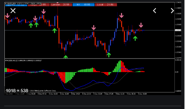
Bar charts are mostly known as price bars as they show price movements for certain time frames. There is a vertical line which shows the highest price and lowest price reached within that period. The opening is marked by a horizontal line to the left of the vertical line. The closing price is indicated by a horizontal line to the right of the vertical line. These are also known as tick marks. The color coding is done which indicates whether the price is moved up or down. This can be seen in the above forex trading chart.
How is this important to traders?
Patterns can be easily observed through bar charts which is very helpful for traders. This is why it is a basic tool for technical analysis. The time period depends on the type of trader you are. For example, if you are a day trader, then a 1-minute bar chart is what they could look for. This shows a new price bar each minute.
If you are a long-term trader, then you can look at trends of a few weeks or months depending on how much risk you are willing to take.
Interpreting bar charts

Bar charts show the open, high, low and close for a specific period as seen in the above diagram. With this, you can see the highest price and the lowest price traded within the given time range. If there is a great distance between the open and close, this indicates that the price has moved significantly. So, if there are higher closes, this is good news for bull investors who purchase securities assuming they can sell at a higher price. But if there are lower closes, then it depicts a bearish market sentiment.
The closing price is usually important so you can see how the trading went within the day or week.
The trends are also marked by colors where uptrends are green or black in color whereas downtrends are red in color.
Bar Charts vs. Candlestick charts
Usually these bar charts are often similar to Japanese candlestick charts. Now bar charts work with tick marks which was explained above. Candlestick charts work where they cluster data for multiple time frames into single price bars. They also have those lines that bar charts have, but the open and close is depicted differently. It is denoted by ‘real body’. This uses a color pattern. If the close is below open, it is red and if it is above the open, it is green or white.
Example of a Bar chart
When you look at bar charts like the one above, these colors are the visual identification of the trends. As prices increase, you see more green than red, which is a good indication. An uptrend will show moving higher even the average. When it goes the opposite way, which is lower, then its known as pull back or trend reversal.